GardenVariety Case Study
Overview
GardenVariety is a local florist looking to create a sales platform with the capability of scheduling pick-up orders as well as local deliveries. They offer a variety flowers and arrangements for different events. GardenVariety is targeting customers who are trying to save time and streamline their errands.
Duration
October 2022 - January 2023
Problem
Potential customers are being lost due to time constraints in their professional and personal lives as well as lack of general florist knowledge.
Goal
Design a sales platform for GardenVariety that provides a seamless ordering process, and allows users to schedule timing that works for them.
Role & Responsibilities
As the lead UX designer and researcher for GardenVariety, I was responsible for conducting interviews, creating personas, journey mapping, conducting competitive audits, establishing branding, low and high-fidelity prototyping, identifying patterns and insights, conducting usability studies, and accounting for accessibility.
Understanding the User
User Research | Personas | Problem Statements | User Journey Maps
User Research
I conducted interviews and created empathy maps to better understand the users and their needs. The common theme was that our participants are working adults who don’t have the availability to add a trip to the florist to their schedule.
The user group confirmed an early assumption about GardenVariety customers, and revealed more issues limiting the customer base. Our additional findings included a quality concerns, accessible information regarding service offerings, and price.
Pain Points
Availability
Working adults are too busy to spend time at a florist picking out fresh flowers.
Accessibility
Existing florists don’t provide occasion and care information for specific flowers and arrangements.
Quality
Large flower delivery services can’t be trusted to consistently deliver a quality product.
Price
National florist services have more overhead to cover and the customer pays for it.
Persona & User Journey
Alice Johnson is a busy mother and pediatrician who needs to streamline her errands because she is managing an extremely tight schedule. Mapping Alice’s user journey revealed how helpful it would be to schedule orders for pick up at a time that is convenient for the user.
Starting the Design
Paper Wireframes | Digital Wireframes | Low-fidelity Prototype | Usability Studies
Sitemap
The GardenVariety team and I determined that a hierarchical website structure was best suited for the sales platform.
Paper Wireframes
I used pen and paper for the first iteration of wireframes to quickly draft each screen of the main user journey in the app to ensure an efficient process. I prioritized ease of access and straightforward navigation for user.
Pen and paper were used again for the initial mobile site designs. This allowed us to quickly come up with ideas for how to layout the same amount of information in a much smaller space.
Digital Wireframes
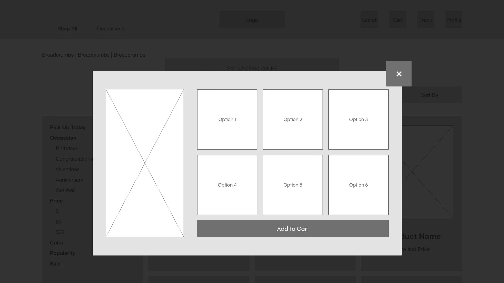
As the process continued, I developed and refined digital wireframes based on the feedback and findings of the user research.
Desktop
Mobile
The mobile versions of the GardenVariety wireframes offer a vertically stacked, scroll-able version of the desktop homepage. Using a vertical layout allowed us to have a fully functioning mobile site without sacrificing any information
Maintaining functionality and ensuring visibility for each component took precedence when deciding how to lay out the mobile site. The quick add feature, and the product descriptions are still available for the customers’ convenience, and on the product details page, the product options are split into two columns for ease of use as well as maintaining a button size that does not lose legibility.
Low-fidelity Prototype
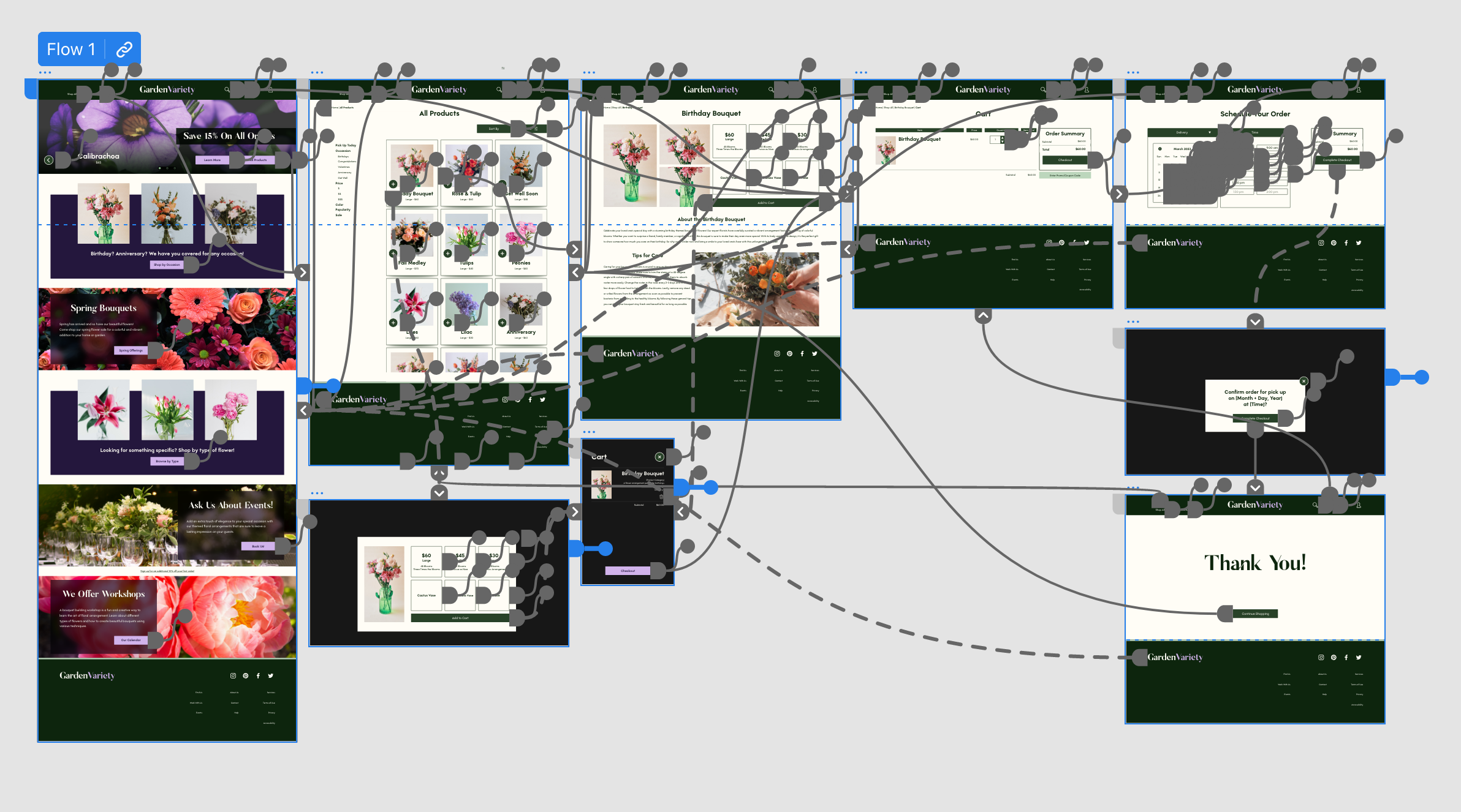
The low-fidelity prototype provides a user flow from the homepage through a successful purchase and time scheduling, so the prototype could be used in a usability study with users.
Usability Study Findings
I conducted two rounds of usability studies. The first round findings informed the designs from wireframes to mockups. The second round used a high-fidelity prototype and revealed what design aspects needed refining.
Round 1 Findings
Users want options that fit their schedule
Users want straightforward product navigation
Users want quality assurance
Round 2 Findings
Some navigation cues are not as clear as they could be
Users expect to have items added to cart rather than navigate to checkout page
Refining the Design
Mockups | High-fidelity Prototype | Accessibility
Mockups
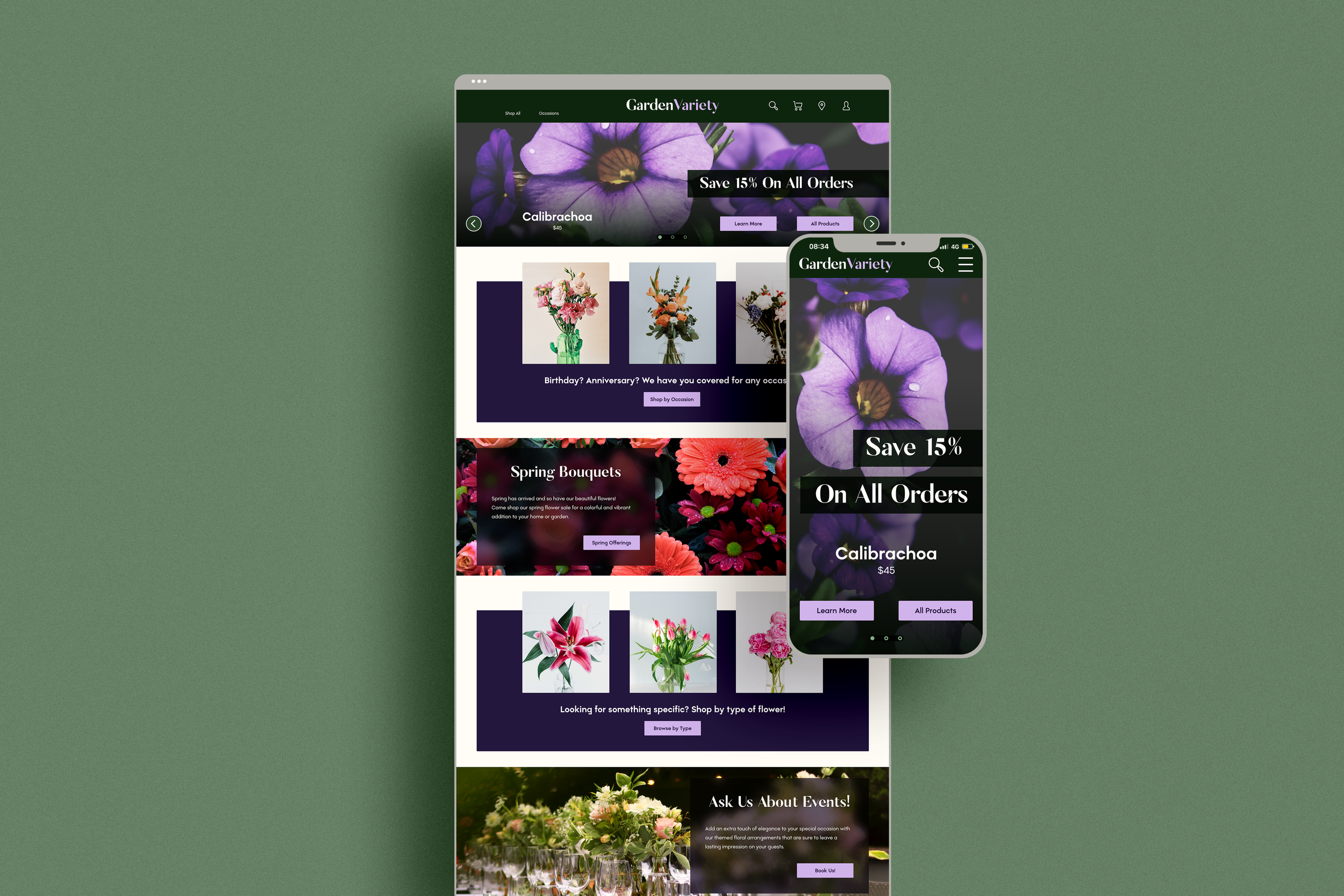
Early designs were focused on making sure necessary information was able to fit on the home page. After the usability studies immersive imagery was added with the necessary adjustments to text areas to ensure accessibility.
Usability studies showed that a non-functioning calendar confused the users. A fully functioning calendar was added to the prototype, along with more working time-slot options in a proper container to help organize components.
Desktop
Mobile
The vertically stacked mobile version lays out the same information found in the desktop version on a condensed screen. The mobile site also employees icons for quick navigation at the bottom of the screen.
The gallery features the full mobile home page, and two screen views within a mobile device.
High-fidelity Prototype
The final high-fidelity prototype features a cohesive design system and meets the user needs for a straightforward user flow with improved navigation cues.
Accessibility Considerations
Ensured color contrast meets WCAG AA standards
Used icons to improve ease of navigation
Used component states to show visual changes when components are highlighted, or selected
Going Forward
Takeaways | Next Steps
Takeaways
Impact: User insights allowed the creation of a platform that fully meets the users’ needs. GardenVariety is anticipating an influx of users at the launch of the new website.
What I Learned: While designing GardenVariety’s sales platform, I learned how efficient using a pen and paper can be in the initial design stages. Creating wireframes on paper allowed us to move past design elements that weren’t working and find solutions quickly.
Next Steps
1
Work with developers to ensure the website is launched with the specifications in the prototype document.
2
Conduct another round of usability studies after launch to validate that user pain points have been addressed.
3
Continue to conduct user research and make updates accordingly to ensure the best possible user experience.


