Pivot Case Study
Overview
Pivot is an app designed to assist users in changing career paths. Whether they’re looking to switch industries or explore new roles within their current field, Pivot provides the guidance and resources you need to make a seamless transition.
Duration
April 2023 - July 2023
Problem
Many people do not know how to go about switching career paths. There are even roadblocks for changing roles within your current field.
Goal
Design an app and corresponding website that provides users with clear steps toward the career change they want to make.
Role & Responsibilities
As the lead UX designer and researcher for Pivot, I was responsible for conducting interviews, creating personas, journey mapping, conducting competitive audits, establishing branding, low and high-fidelity prototyping, identifying patterns and insights, conducting usability studies, and accounting for accessibility.
Understanding the User
User Research | Personas | Problem Statements | User Journey Maps
User Research
I conducted interviews and created empathy maps to better understand the users and their needs. The common theme was that our participants are working adults who don’t know the appropriate steps to take for a successful career transition.
The user group confirmed an early assumption about Pivot users, and revealed more issues limiting the user base. Our additional findings included a need for accessible information, clear instructions for users, and methods for tracking progress.
Pain Points
Uncertainty
Early research showed that our potential users are uncertain about the process of changing their career paths.
Barriers
Findings indicated that potential users are worried about barriers they may face while trying to change career paths.
Time
People thinking about switching careers are unsure of the time commitment necessary to successfully change career paths.
Persona & User Journey
John Carter is a Marketing Manager who needs needs guidance to switch from Marketing to Product Management because he is unsure of the steps to take for a successful change.
Starting the Design
Paper Wireframes | Digital Wireframes | Low-fidelity Prototype | Usability Studies
Sitemap
I determined that a linear structure was best suited for the initial survey forms, and a standard hierarchical structure is introduced once the users have completed their profiles.
Paper Wireframes
I used pen and paper for the first iteration of wireframes to quickly draft each screen of the main user journey in the app to ensure an efficient process. I prioritized ease of access and straightforward navigation for user.
Pen and paper were used again for the initial mobile site designs. This allowed us to quickly come up with ideas for how to layout information, and provided an initial idea for how many screens would be necessary for the first prototype.
Digital Wireframes
As the process continued, I developed and refined digital wireframes based on the feedback and findings of the user research.
Mobile Application
Desktop
The desktop version of the Pivot wireframes offer a maintain the same straightforward reading and tab order that are present in the mobile design.
Maintaining functionality and ensuring visibility for each component took precedence when deciding how to lay out the application information. The progress bar at the top of the screen added context were added for the users’ convenience. It was imperative to make responsive designs with progressive enhancement in mind so users would be able to access the same information across platforms.
Low-fidelity Prototype
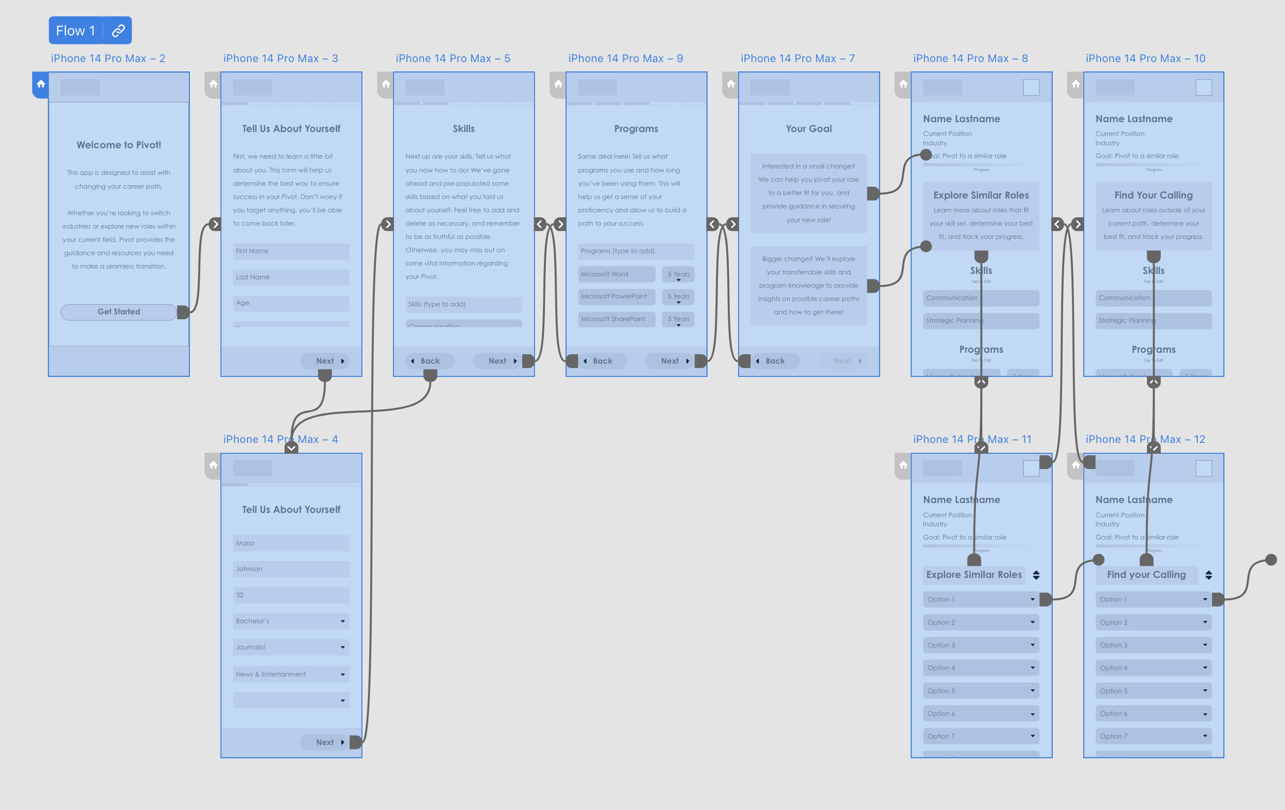
The low-fidelity prototype provides a user flow from the app loading screen through successfully creating a user profile, so the prototype would be viable in a usability studies.
View the Pivot low-fidelity Prototype.
Usability Study Findings
I conducted two rounds of usability studies. The first round findings informed the designs from wireframes to mockups. The second round used a high-fidelity prototype and revealed what design aspects needed refining.
Round 1 Findings
Users want more context within the app
Users were uncertain about the time commitment as well as the app’s purpose
Users wanted better organization in the survey
Round 2 Findings
The method for measuring progress through the survey forms needs to be more obvious
Users expect to be able to interact with the forms in the prototype
Refining the Design
Mockups | High-fidelity Prototype | Accessibility
Mockups
My goal was to increase clarity of the objective. Instead of providing two broad options for their goal users who know exactly what they want to do can use the search function, and users who are unsure can search through filtered lists. The progress meter at the top also provides more clarity to the users.
Continuing the change, greater emphasis was placed on organization. The survey screens were re-designed to be more straightforward and use familiar design cues such as text entry boxes and visible delete icons. The profile screen was also streamlined to show the biographical information entered by the users as well as a progress overview. In the new version, a full progress meter along with steps toward the users goal are available on a separate screen.
Mobile Application
Desktop
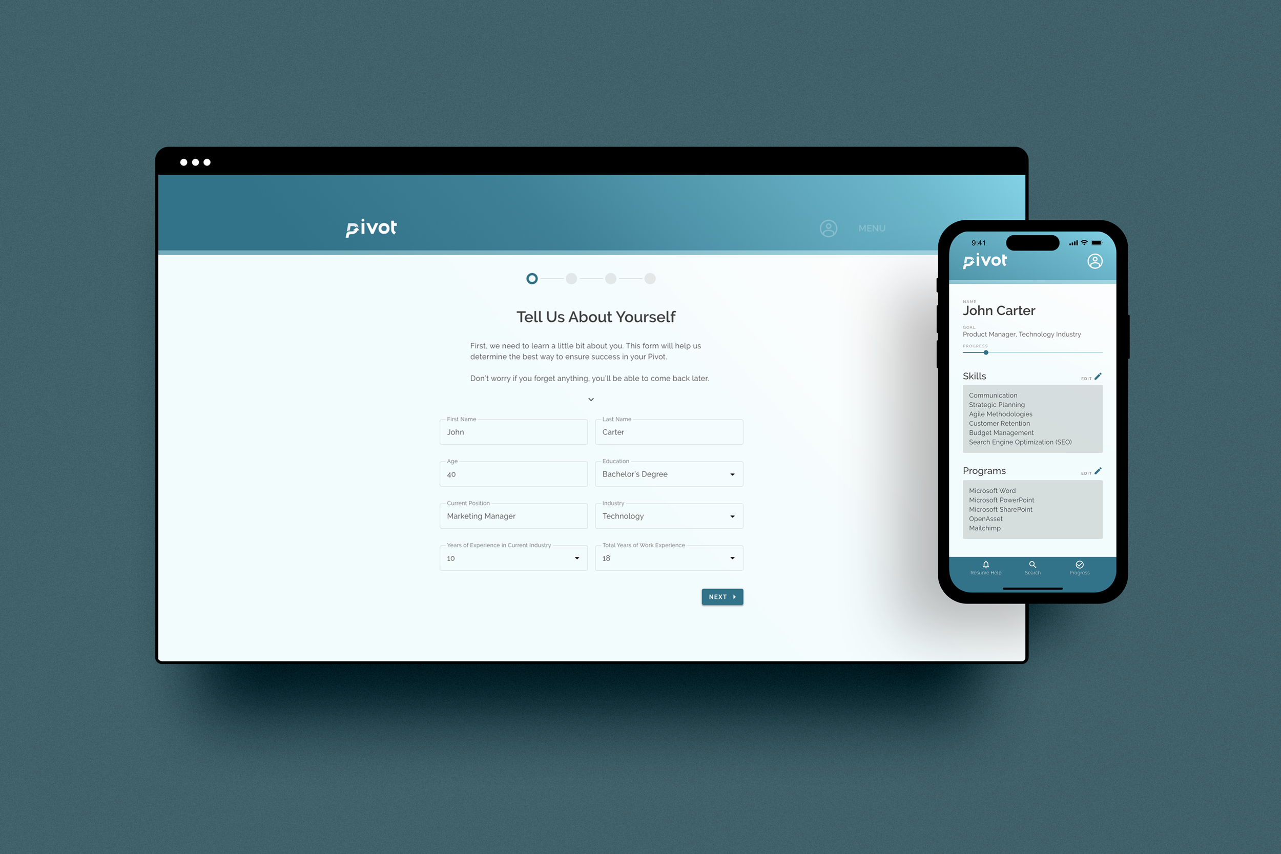
The desktop version of Pivot lays out the same information found in the mobile application and maintains the design system using progressive enhancement.
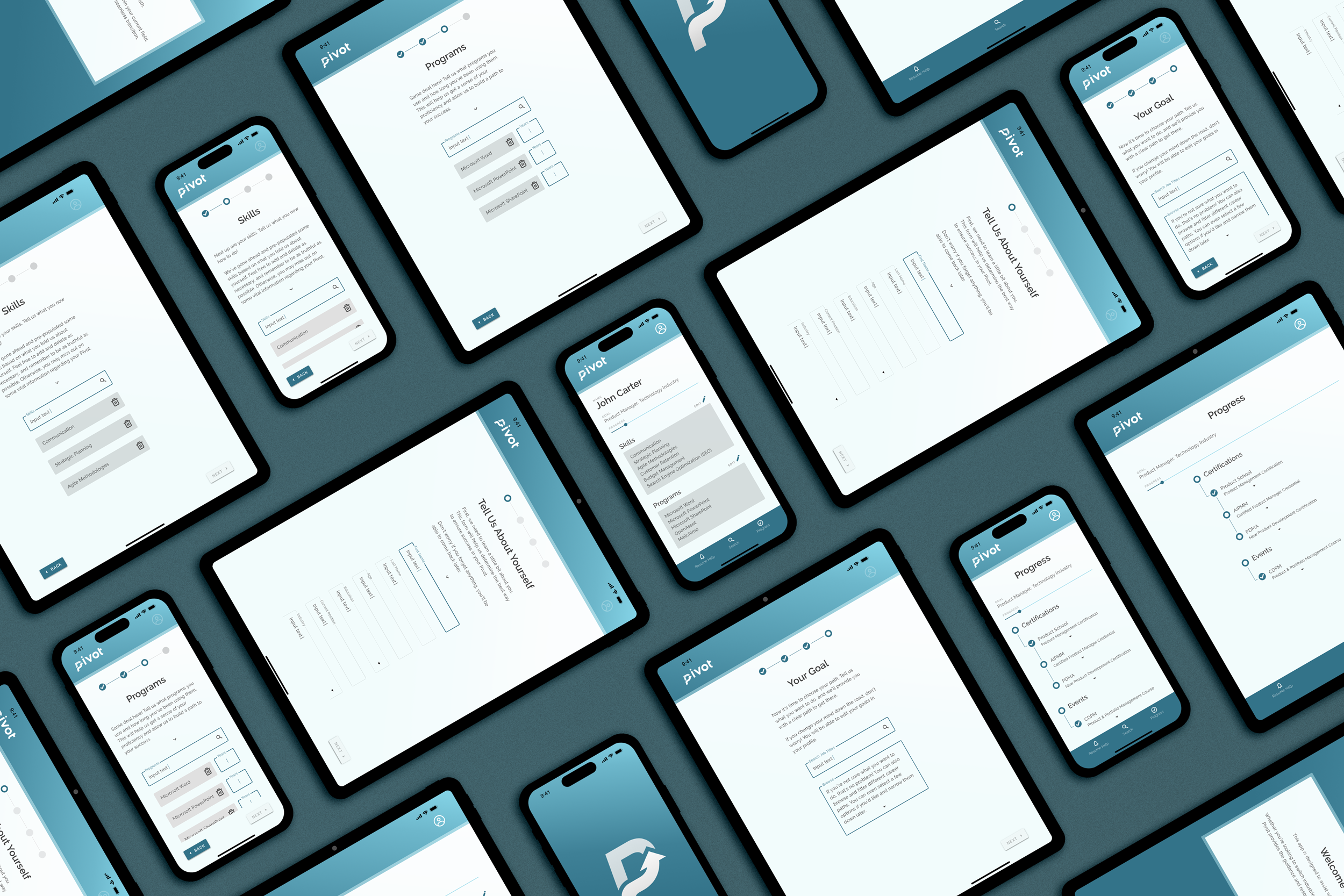
The gallery features the full desktop introductory survey process as well as an example of the survey being successfully filled out.
High-fidelity Prototype
The final high-fidelity prototype features a cohesive design system and meets the user needs for a straightforward user flow with improved context and interactivity.
Accessibility Considerations
Ensured color contrast meets WCAG AAA standards
Text sizes were carefully considered to meet WCAG AAA standards
Tab order and focus were taken into account with the mobile version being linear and the responsive designs following suit
Going Forward
Takeaways | Next Steps
Takeaways
Impact: User insights allowed the creation of a platform that fully meets the users’ needs and alleviates their fears while entertaining the idea of changing career paths. Pivot is anticipating an influx of users who are interested in knowing what their options are and how to make a successful change.
What I Learned: Users are excited about the idea of being provided with step-by-step help in moving on to new opportunities. There is a real use case for an application that removes a significant amount of stress and guesswork from a process that has a massive life impact.
Next Steps
1
Continuing to build out pages of the app for developers. Currently the survey is the most fleshed out, but the rest need to be designed before the app is fully developed.
2
Conduct another round of usability studies after launch to validate that user pain points have been addressed.
3
Continue to conduct user research and make updates accordingly to ensure the best possible user experience.


